Hello Kheltari. It is I, Eloisanon, if you remember me. I wish to inquire you about how you color and render your drawings.
I remember that you once told me that I shouldn’t do what others do, but rather do what I see from nature, but I really struggle with this when it comes to color and rendering. You have a very beautiful way with color. Even those that you call sketches are so full of life. The lighting even looks real, while keeping this dreamy look to it. I love it. How do you do it?
Sure!!! Thank you by the way, I’d love to help, do you have any specific inquiries? also I will try to respond best right now
I know it sounds counterintuitive, but in reality that’s it, I just think “what looks good” in a picture and do it
I don’t care if it’s correct or I don’t care if it’s accurate, as long as it looks good I’ll put it
Now I’m not telling you to throw out everything through the window, but instead I’m telling you to trust yourself and play with the colors
observe how I drew the shark, I was mostly just dicking around with the software brushes and it started as a simple blue sphere
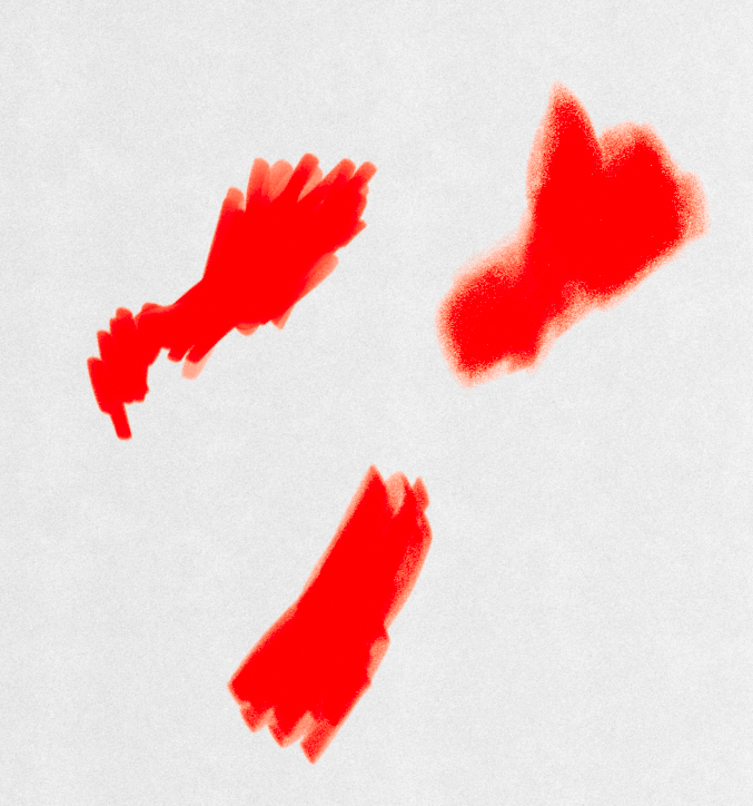
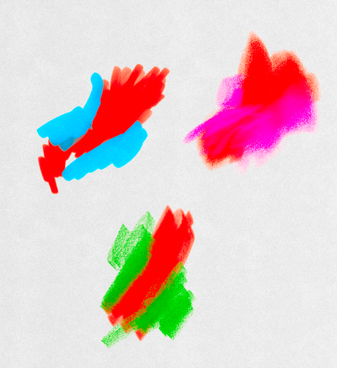
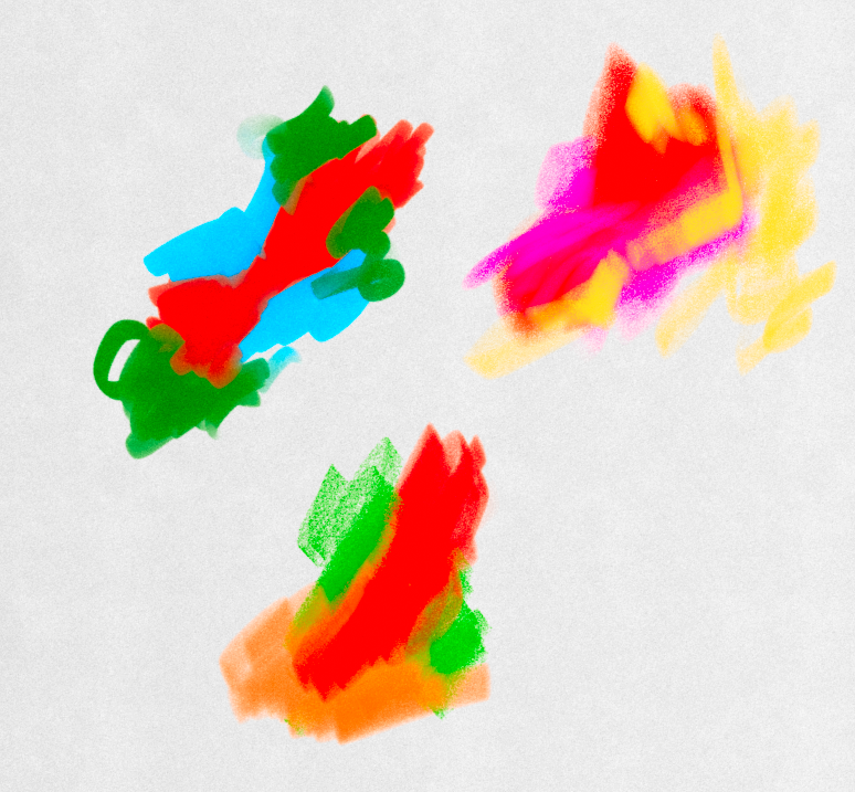
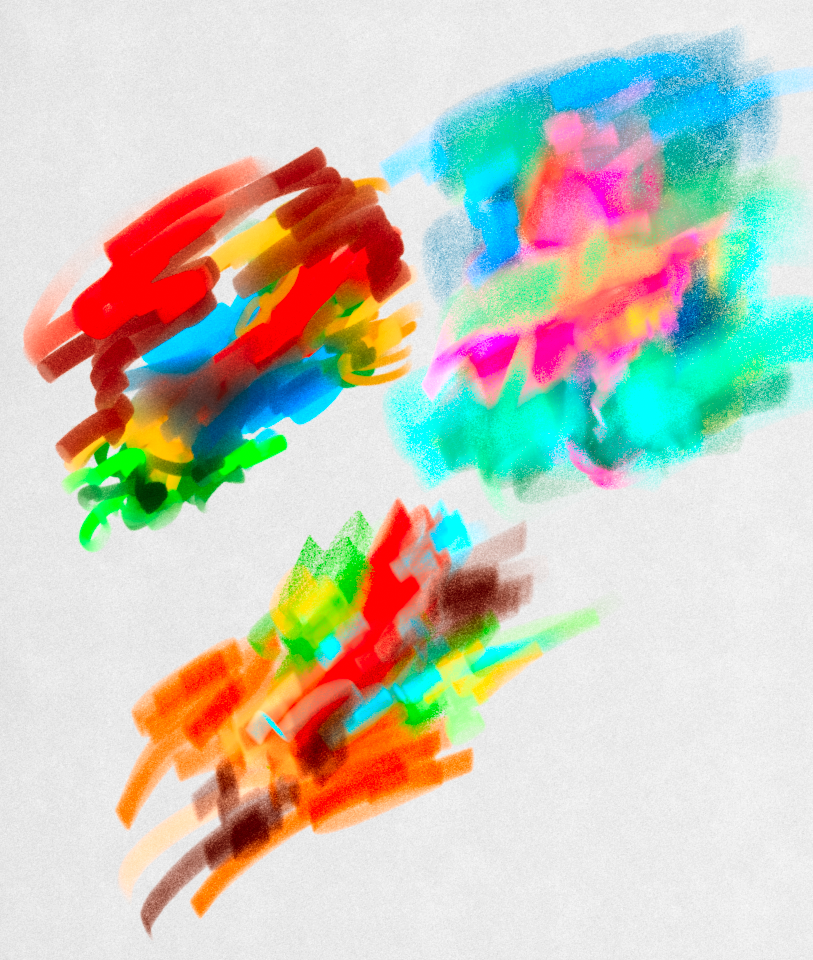
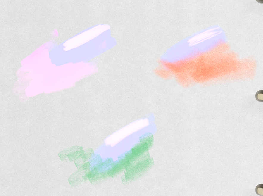
– My process goes… I’ll use a main color, let’s say red because the character is prominent in red[1] – Now let’s try some combinations, let’s see what works and what doesn’t work, what would look good? [2] – Let’s push it by adding more dashes of other colors, I do not pick these colors via color wheel or some other rules, I just pick at random and think what works and what doesn’t, it’s lot’s of experimenting [3] – I like the bottom and top right, not so much the top left, so I add even MORE color but with different tones to see how they look [4]
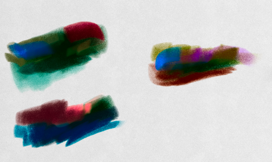
I end up with palettes like this, as you can see they are very bright since I used a very bright red at the start
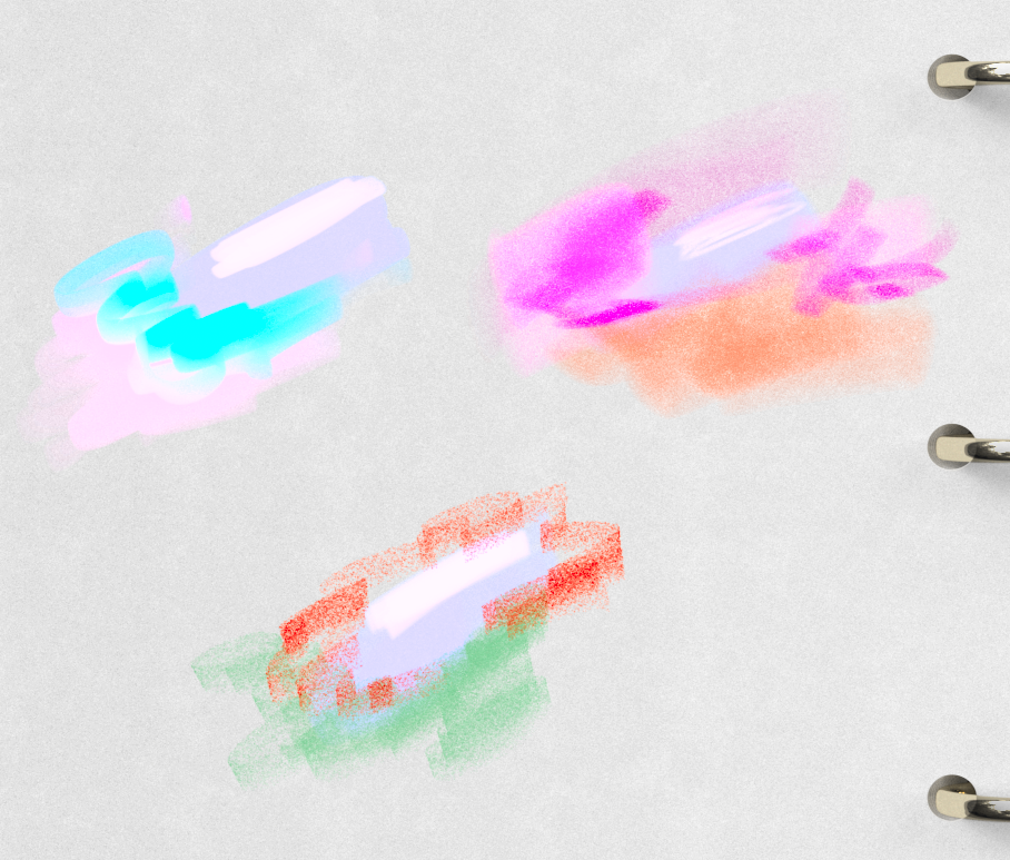
Now let’s do the same combination… with a muted blue and white color [5][6] and a dark green [7] but apply the same
And there we go!! here’s a video showing every step I did
This was just for doing starting colors of red, later one you can do this for every color you can think on your image and you can do this as many times as you want. I usually treat every section differently of the painting, rather than trying to look for some “harmonic balance” or something, I just add what I think is lacking. Again sorry for being vague there, but it really is that!! go to my vault section and look at the top 3 images, the “inspirations” I had and influence map, they should give you a good background of what I used to look for when trying to learn stuff
I do suggest you do look at the videos in the image I put in the critique page, the one the teaches you how to color
There are a lot of other people you can learn from, James Gurney… Craig Mullins… etc. etc., but I really would suggest you to instead learn colors yourself Forget the color wheel and rules to follow Now, if you want to know how *you* can do your best light and color, I suggest you look at nature and the things around you and observe what colors and tones there are This may take a while but it’s the best you can do, because only you can do what you can do since you see through your eyes what only you can see I am not able to do your lines, and as thus, I am sure I wouldn’t be able to do your coloring
I send you off with best wishes c:
Want a question answered or perhaps some pointers and critique?